- Result
- Setup
- Exploring RowClassesProvider’s functionality
- Seeing it in action
- Applying CSS styles to the Datagrid
- Result
- Final tip: inspiration and default styles
Recently a user on the LinkedIn TwinCAT forum shared and example how to use the RowClassesProvider. When I tried the example and went looking for the documentation, there was none to be found! On the whole internet, there is one (1!) example which sort of shows the function. In this post I will show what the RowClassesProvider does and how you can use it to dynamically color data grids.
- Example code for TcHMI v1.10: GitHub repo, direct download.
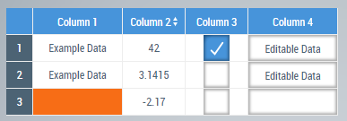
Result
Before diving in, this will be the result:
Setup
In order to explore what RowClassesProvider does let’s make a small sample project.
- Create a new HMI project in Visual Studio by going to File > New > Project and select TwinCAT HMI > TwinCAT HMI Project. Give it an appropriate name and select OK.
- Open the Desktop.view by double clicking on it.
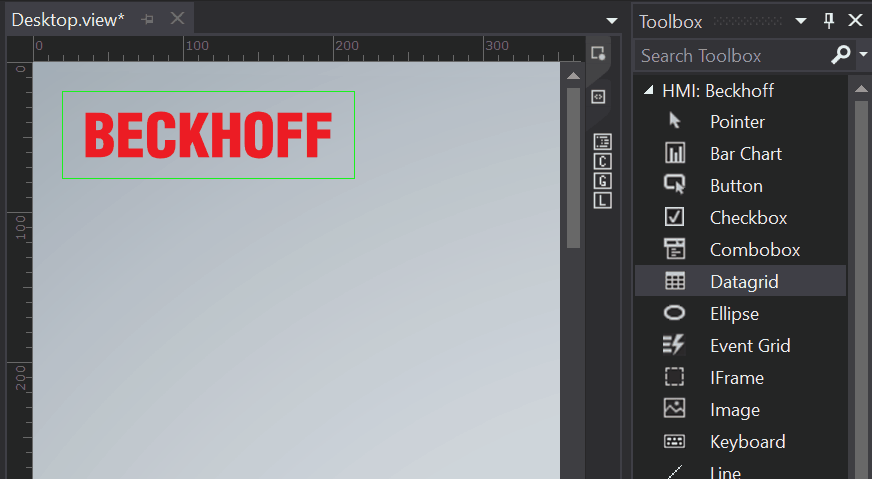
- From the tool bar, drag a Datagrid into the Desktop.view.
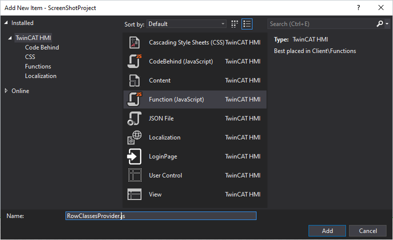
- Add a new JavaScript function by right clicking on your HMI project and select Add > New Item.
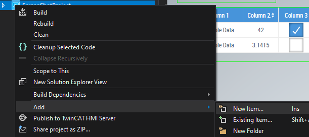
- Then select Function (JavaScript) and give it an appropriate name and select OK.


Exploring RowClassesProvider’s functionality
Now we have a sample project it is time to explore what the RowClassesProvider does.
- Open the
RowClassesProvider.function.jsonfile of the JavaScript function we just created, with a double click. -
In the new window change/add the following things:
- Change the return type to
Array. Later we fill this array to return the styles which should be applied to the Datagrid. - Change the DisplayName of the first variable to
rowDataand select for the DatatypeAny. - Add a new row and change the DisplayName to
rowIndexand for the Datatype selectInteger. - Add another new row and change the DisplayName to
rowNumberand for the Datatype selectInteger.
In the end it should look as shown here:
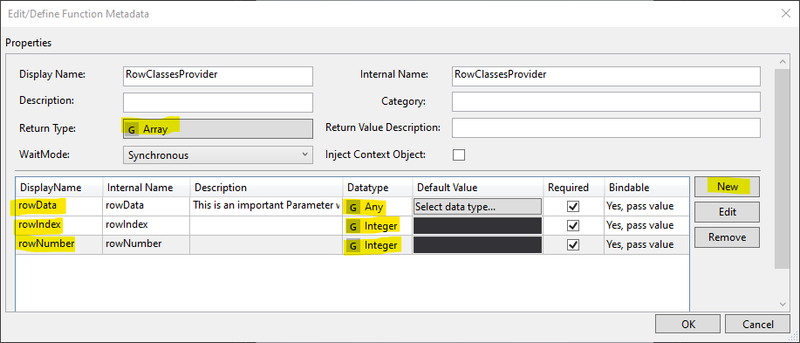
- Change the return type to
- Confirm your changes by selecting OK and confirm your changes in the additional pop-up.
-
In case you had the
RowClassesProvider.jsfile open, you will get a pop-up. The pop-up is caused by the changes you just made. Select Yes to reload the file.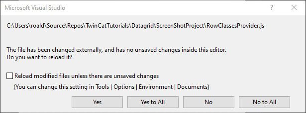


If all went OK your code in RowClassesProvider.js should look as follows (ignoring the <reference path ... lines):
(function (TcHmi) {
  var RowClassesProvider = function (rowData, rowIndex, rowNumber) {};

  TcHmi.Functions.registerFunction("RowClassesProvider", RowClassesProvider);
})(TcHmi);
This function takes three inputs: rowData, rowIndex and rowNumber. The inputs contain information about the selected row of a data grid. To see what this function does, add some logging code to the function:
(function (TcHmi) {
  var RowClassesProvider = function (rowData, rowIndex, rowNumber) {
    console.log("Data: ", rowData);
    console.log(`Index: ${rowIndex}\nNumber: ${rowNumber}`);
  };

  TcHmi.Functions.registerFunction("RowClassesProvider", RowClassesProvider);
})(TcHmi);
Now every time this function is called, it will print in the console with which parameters the function was called.
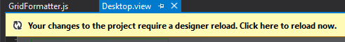
Save the function. After changing the function the designer shows a prompt that it needs to be reloaded. Click on the yellow ribbon to reload the designer.
Next we link this function to our Datagrid. Open the Desktop.view and
- Select the TcHmiDataGrid.
- In the Properties window under Data > RowClassesProvider press the
...button. -
Then find the function we just created and drag it into the right window titled Functions.
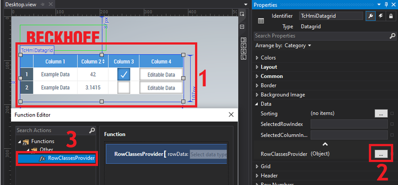
- Select OK to confirm your changes.

Seeing it in action
- Open the Live-View window from TwinCAT HMI > Windows > TwinCAT HMI Live-View.
- Open the developer tools, by clicking on the gear icon on the top.
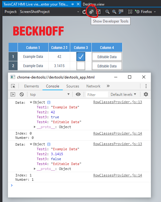

In the developer tools you see the results of the console.log calls in our function. The rowData variable contains all the column data of a single row. The rowIndex and rowNumber both contain the number of the row. I’m not sure why there are two variables containing the same information.
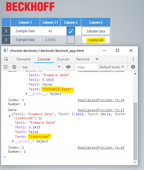
On the initial load of the Desktop.view, all rows were called, However, if later we select a row and make a change, only that row will show up in the log. Here I changed the editable data on the second row to cookncode.
From this example you might start to see how we can use the RowClassesProvider. Basically we can take actions based on any of the received input parameters. Be it any of the rowData columns, or the index of the row.
Applying CSS styles to the Datagrid
You may recall that when we defined the RowClassesProvider function, we also specified it returned an Array. In this section I will fill this array with CSS styles, such that that the datagrid can dynamically change its formatting.
First we will define a custom style in a CSS file. To add a CSS file, right click on the HMI project and select Add > New Item and select Cascading Style Sheet (CSS) and click on Add.
For example we can change the color of a table cell when no data is present. In order to do this we first define a new style by adding the following lines to the .css file:
/* Change the first column's background to orange */
#TcHmiDatagrid tr.missing-input td[data-column-name="Test1"] {
  background-color: #f76d16;
}
Here:
-
#TcHmiDatagridmeans the style is for a TwinCAT HMI datagrid. -
trdenotes a row in a table. -
.missing-inputis the name of the style. -
tddenotes a table data cell. -
data-column-name="Test1"means we apply the style only to a specific column with the name"Test1". I will show in a minute where you can find the column name. -
background-color: #F76D16;is the newly applied background color.
In order to apply the style under certain conditions we change the RowClassesProvider function as follows:
(function (TcHmi) {
  var RowClassesProvider = function (rowData, rowIndex, rowNumber) {
    var cssStyles = []; // Collected CSS styles which will be returned at the end

    if (!rowData.Test1) {
      // If the first column (Test1) is empty
      cssStyles.push("missing-input"); // add the missing-input style to the array
    }

    return cssStyles;
  };

  TcHmi.Functions.registerFunction("RowClassesProvider", RowClassesProvider);
})(TcHmi);
Now the RowClassesProvider returns an array with the style names which should be applied. For now the missing-input style is added in case the input of the first column is empty.
Before we see it in action, we first need to add another row to our Datagrid, since currently all columns contain data. Open the Desktop.view and select the ... of the SrcData in the Properties window.
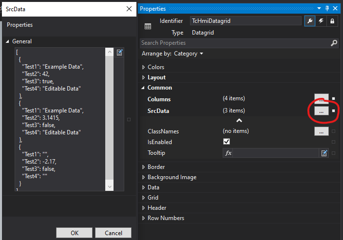
Add four new columns, where Test1 is just an empty string. Note that here you can see the names of each of the columns. You can also give them more descriptive names for your application. It is also possible to link the source data to a struct in your PLC project, but this is outside of the scope of this tutorial. After you’ve made the changes click OK and open the live view.
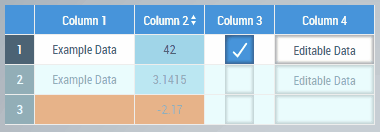
If all went well, the first column of the third row should be orange.
Styles can also be applied dynamically after for example toggling a checkbox, based on the value of a text field or the style of a whole row can be changed based on the state of a single column. To do so, change the .css file as follows:
/*Change the background color of the first column to orange*/
#TcHmiDatagrid tr.missing-input td[data-column-name="Test1"] {
  background-color: #f76d16;
}

/*Change the second column's background to orange*/
#TcHmiDatagrid tr.below-zero td[data-column-name="Test2"] {
  background-color: #f76d16;
}

/*A default background color for the second column*/
#TcHmiDatagrid tr td[data-column-name="Test2"] {
  background-color: #a0d5e8;
}

/*Change the background color of an entire row if a check box' state is changed*/
#TcHmiDatagrid tr.not-checked td::after {
  content: "";
  position: absolute;
  top: 0;
  right: 0;
  bottom: 0;
  left: 0;
  width: 100%;
  height: 10000px;
  pointer-events: none;
  z-index: 1;
  background-color: rgba(215, 249, 251, 0.5);
}

/*Make the text in the fourth column bold and change the color*/
#TcHmiDatagrid tr.bold td[data-column-name="Test4"] {
  font-weight: bold;
  color: #f76d16;
}
and change RowClassesProvider into
(function (TcHmi) {
  var RowClassesProvider = function (rowData, rowIndex, rowNumber) {
    var cssStyles = []; // Collected CSS styles which will be returned at the end

    if (!rowData.Test1) {
      // If the first column (Test1) is empty
      cssStyles.push("missing-input"); // add the missing-input style to the array
    }

    if (rowData.Test2 < 0) {
      // If the value of the second column is negative
      cssStyles.push("below-zero"); // add the below-zero style
    }

    if (!rowData.Test3) {
      // If the checkbox in the third column is not checked
      cssStyles.push("not-checked");
    }

    if (rowData.Test4 == "cookncode") {
      // if the text in the fourth column is cookncode
      cssStyles.push("bold");
    }

    return cssStyles;
  };

  TcHmi.Functions.registerFunction("RowClassesProvider", RowClassesProvider);
})(TcHmi);
Result
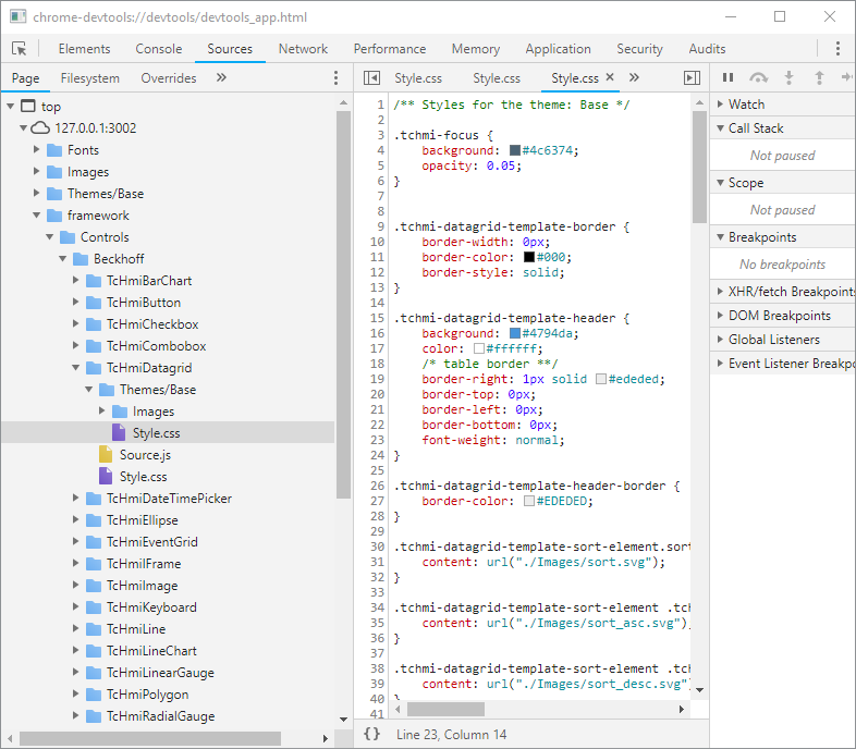
Final tip: inspiration and default styles
If you’re looking for inspiration what you can change or what the default styles of Beckhoff’s controls are, you can find these if you open the developer console. Then go to the Sources tab and navigate to a folder. Here I show the Base theme style for the Datagrid.